
Modal 구현해보기
라이브러리 없이 구현해보기
라이브러리 없이 재사용가능한 Modal 컴포넌트를 구현해보겠습니다.
e.stopPropagation()메서드를 활용해 이벤트 전파 차단children props활용해 재사용성 확보
children props는 부모 컴포넌트 사이의 내용을 자동 전달 받습니다.
1
2
3
4
5
6
7
8
9
10
11
12
13
14
15
16
17
18
19
20
21
22
23
24
25
26
27
28
29
30
31
32
33
34
35
36
37
38
39
// Modal.jsx
import styled from "styled-components";

const Modal = ({ modalOpen, onChange, children }) => {
  // 만약 isOpen이 false이면 null을 반환하여 모달을 렌더링하지 않음
  return (
    modalOpen && (
      <ModalWrapper onClick={onChange} className="modal-overlay">
        <ModalBox onClick={(e) => e.stopPropagation()} className="modal">
          {children}
        </ModalBox>
      </ModalWrapper>
    )
  );
};

const ModalWrapper = styled.div`
  position: fixed;
  top: 0;
  left: 0;
  width: 100%;
  height: 100%;
  background-color: rgba(0, 0, 0, 0.5);

  display: flex;
  justify-content: center;
  align-items: center;
  z-index: 1;
`;

const ModalBox = styled.div`
  position: relative;
  padding: 24px 48px;
  border-radius: 8px;
  background: white;
  z-index: 2;
`;

export default Modal;
라이브러리로 구현해보기
react-modal 라이브러리를 활용해서 재사용가능한 Modal 컴포넌트를 구현해보겠습니다.
설치
1
npm i react-modal
react-modal 라이브러리를 import 한 후 컴포넌트에 여러 옵션들을 지정해주어 사용합니다.
주요 옵션들
isOpen : 모달 창의 표시 여부를 결정하는 값으로 true 지정 시 창이 켜집니다.
onRequestClose :
ESC키를 누르거나 오버레이 부분을 클릭할 때, 실행되는 함수입니다.isOpen 값을 false로 바꿔주는 콜백 함수를 지정하면 모달 창이 꺼집니다.
style : 모달 창과 모달 창 바깥 오버레이에 대한 style을 지정합니다.
{overlay : {}, content : {}}
overlay는 바깥 부분, content는 모달 창 부분ariaHideApp : appElement를 숨길지 여부를 나타내는 boolean 값으로 true 지정 시 appElement를 숨깁니다.
콘솔 에러
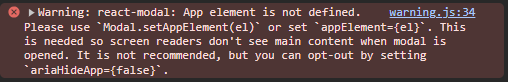
App 요소가 정의되지 않았습니다.
Modal.setAppElement(el)을 사용하거나appElement={el}를 설정해라, 또는 권장하진 않지만ariaHideApp={false}를 사용할 수도 있다. 이는 모달이 열릴 때 스크린리더가 기본 내용을 볼 수 없도록 하기 위함이다.
이는 모달이 열렸을 때 화면을 바라보고 있는 사용자가 모달창이 아닌 다른 컴포넌트의 content를 바라보지 않도록 하기 위해 숨겨줄 엘리먼트를 정의해주는 것을 말합니다. (출처)
해결 방법
appElement = {el}사용Modal.setAppElement(el)사용ariaHideApp : false설정 (비권장)
최종 코드
1
2
3
4
5
6
7
8
9
10
11
12
13
14
15
16
17
18
19
20
21
22
23
24
25
26
27
28
29
30
31
32
33
34
35
36
37
38
import Modal from "react-modal";

const ReactModal = ({ modalOpen, onChange, children }) => {
  return (
    <Modal
      isOpen={modalOpen}
      onRequestClose={onChange}
      style={customModalStyles}
      appElement={document.getElementById("root") || undefined}
    >
      {children}
    </Modal>
  );
};

const customModalStyles = {
  overlay: {
    position: "fixed",
    top: "0",
    left: "0",
    width: "100%",
    height: "100%",
    backgroundColor: "rgba(0, 0, 0, 0.5)",

    display: "flex",
    justifyContent: "center",
    alignItems: "center",
    zIndex: "1",
  },
  content: {
    position: "relative",
    padding: "24px 48px",
    borderRadius: "8px",
    background: "white",
  },
};

export default ReactModal;