Material UI (MUI)
Material UI는 Google의 Material Design을 구현하는 React 오픈소스 라이브러리입니다.
디자인을 구현할 수 있는 여러 컬렉션을 컴포넌트를 사용하듯이 조립해 쉽게 디자인을 할 수 있습니다.
기본적으로 제공하는 컬렉션 외에도 자유롭게 커스터마이징해서 사용할 수 있습니다.
호환성 및 변경의 자유로움이 가장 큰 장점으로 React Project에서 많이 사용되고 있습니다.
- 플랫 디자인
- 단순한 색상과 구성을 통해 직관적인 인식이 가능하도록 구성하는 2차원 디자인 방식
- Material Design
- 플랫 디자인의 장점을 살리면서도 빛에 따른 종이의 그림자 효과를 이용하여 입체감을 살리는 디자인 방식을 말한다.
MUI는 앞서 정리한 Emotion을 기반으로 실행됩니다.
사용방법
설치
1
npm install @mui/system @emotion/react @emotion/styled
emotion을 기반으로 돌아가기때문에 emotion도 필수적으로 설치해야합니다.
MUI는 사용할 Component를 import해서 사용하는 방식으로 아주 간단합니다.
MUI 공식 홈페이지에서 Component를 확인해 Button을 가져와 보겠습니다.
1
2
3
4
5
6
7
import Button from "@mui/material/Button";

const BasicButtons = () => {
  return <Button variant="contained">Contained</Button>;
};

export default BasicButtons;
위 코드의 variant와 같이 MUI에서 제공해주는 Prop를 설정해주는 것만으로 다양한 디자인을 쉽게 적용할 수 있습니다.
커스터마이징
MUI의 컨포넌트를 사용자가 직접 커스터마이징할 수도 있습니다.
sx Prop
커스터마이징할 컴포넌트에 sx 속성을 주어 변경합니다.
1 2 3 4 5 6 7 8 9 10 11 12 13 14
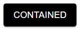
import Button from "@mui/material/Button"; const BasicButtons = () => { return ( <Button variant="contained" sx= > Contained </Button> ); }; export default BasicButtons;
![mui-button-black]()
배경색이 검정생으로 변경되었습니다.
styled 함수
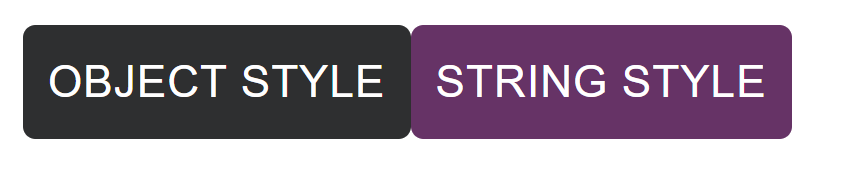
@mui/material/styled 에서 styled 함수를 import해서 사용합니다.
객체 형태와 문자열 형태 모두 사용 가능합니다.
1
2
3
4
5
6
7
8
9
10
11
12
13
14
15
16
17
18
19
20
21
22
23
24
25
26
import React from "react";
import Button from "@mui/material/Button";
import { styled } from "@mui/material/styles";

// Object Style
const StyledButton = styled(Button)({
  color: "white",
  backgroundColor: "#000000",
});

// String Style
const StyledBtn = styled(Button)`
  color: white;
  background-color: #663366;
`;

const BasicButtons = () => {
  return (
    <>
      <StyledButton>Object Style</StyledButton>
      <StyledBtn>String Style</StyledBtn>
    </>
  );
};

export default BasicButtons;
![mui-button-styled]()